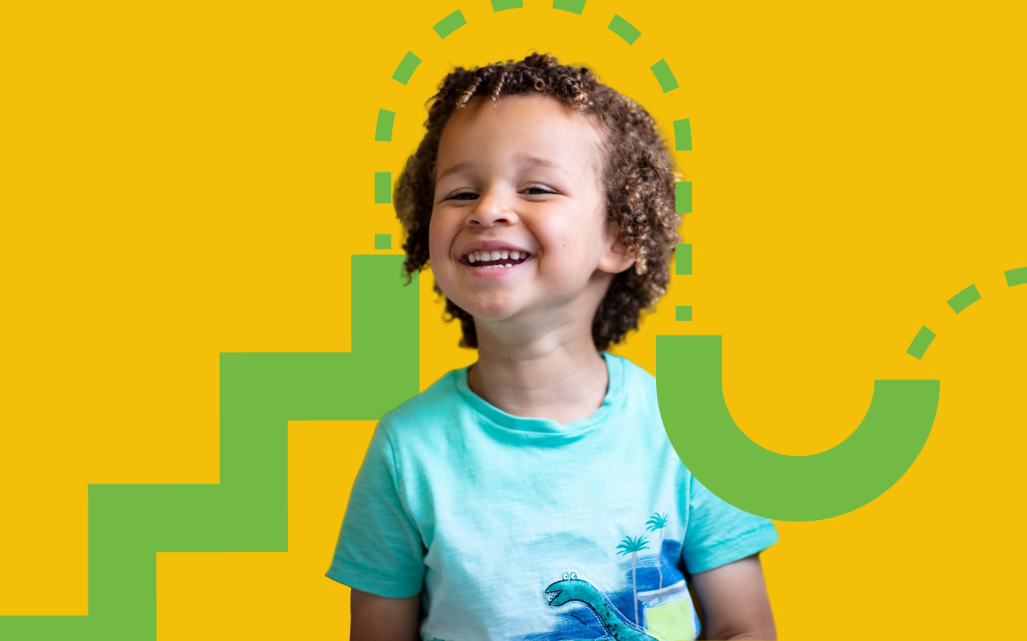
Barnardos Annual Report & Financial Statements 2021
Taking you on a journey through the Barnardos Annual Report & Financial Statements 2021, Because Childhood Lasts a Lifetime.
sector
Not-for-profit
services
Interactive PDF Design
Creative Copywriting & Editing
Infographics, Charts & Tables
We were invited to tender for children’s charity; Barnardos’, annual report back in January 2022. Going for a fully digital, interactive final document, our team of digital experts were best placed to bring this project to life and upon a meeting of both parties, it was decidedly a great fit.
The overarching theme for the report was “Because Childhood Lasts a Lifetime” tying into the importance of our childhood and the role it plays in our adult lives as the years go by. Our first step was to create a reverse brief to make sure the approach and deliverables were nailed down from the get-go. After a considerable amount of research, which forms the foundation of all our projects, we developed two concepts for Barnardos along with some sample spreads to set the design foundation for the report.
The chosen concept was “Life’s Journey” - drawing inspiration from the notion that Barnardos is a guide for children as they navigate through their childhood and beyond into adolescence and adulthood. Highlighting this journey, we created a continuous line or maplike structure which aimed to bring readers on their own journey through the document as well as reinforcing the valuable messages, facts and figures necessary to bring to the forefront.
The copywriting team immersed themselves into the Barnardos brand tone of voice, we delved into over 160 pages of text, tables and charts. With a document that has been worked on by a number of different departments and individuals, there was a large body of work to rework into one voice, while at the same time, proofing for spelling and grammatical errors, structuring the report and selecting pull quotes and areas of interest throughout. As Barnardos are aligned with the UN Sustainability Goals, we created a legend system whereby areas were marked with a little leaf icon that corresponded to the goals.
After a few rounds, we signed off on the text and moved into content flowing, which laid the groundwork for the full document design. The team broke into sections here, with one designer responsible for infographics, charts and tables, and another for the navigation and page layout.
We wove the concept of “life’s journey” throughout while at the same time, staying true to the core Barnardos branding.
“Barnardos decided to work with a new agency, Good As Gold, on our Annual Report & Financial Statements 2021. The Annual Report is a very important document for the organisation and is a huge undertaking for the agency we work with. Danielle and Lauren could not have been nicer and easier to work with. Good As Gold were very supportive, so patient and kind, particularly when there was extra pressure on getting this project across the line. The finished product looks great and captures the organisation’s values and mission perfectly. Thank you so much and we look forward to working with you in the future.”


